A Modernized Site That Honors Legacy While Embracing the Future
The Challenge: EHD Insurance needed a modern website that reflected their credibility, scale, and full-service capabilities. While the previous site had plenty of content, it lacked a clear structure, hierarchy, and modern aesthetic. Navigation was clunky, key service areas were blended together, and the brand presentation felt outdated. As a large independent insurance firm, EHD offers three core service areas—Personal, Commercial, and Employee Benefits—but the digital experience didn’t support clear differentiation between them. The challenge was to deliver a clean, modern website that unified their brand while making it easy to explore each pillar independently.
Our Approach: We focused on building a digital presence that was user-friendly, brand-consistent, and designed for long-term flexibility. Our strategy included:
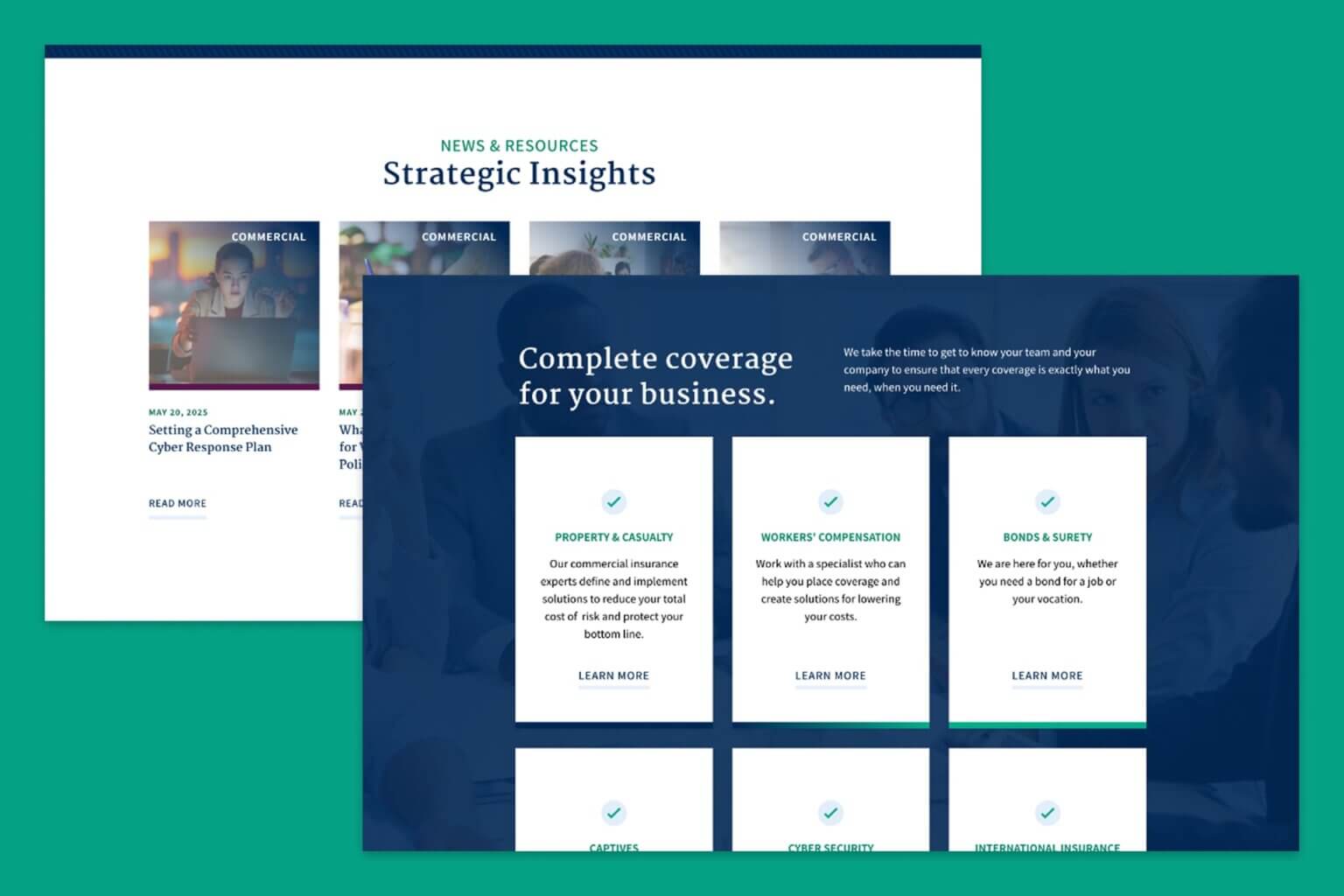
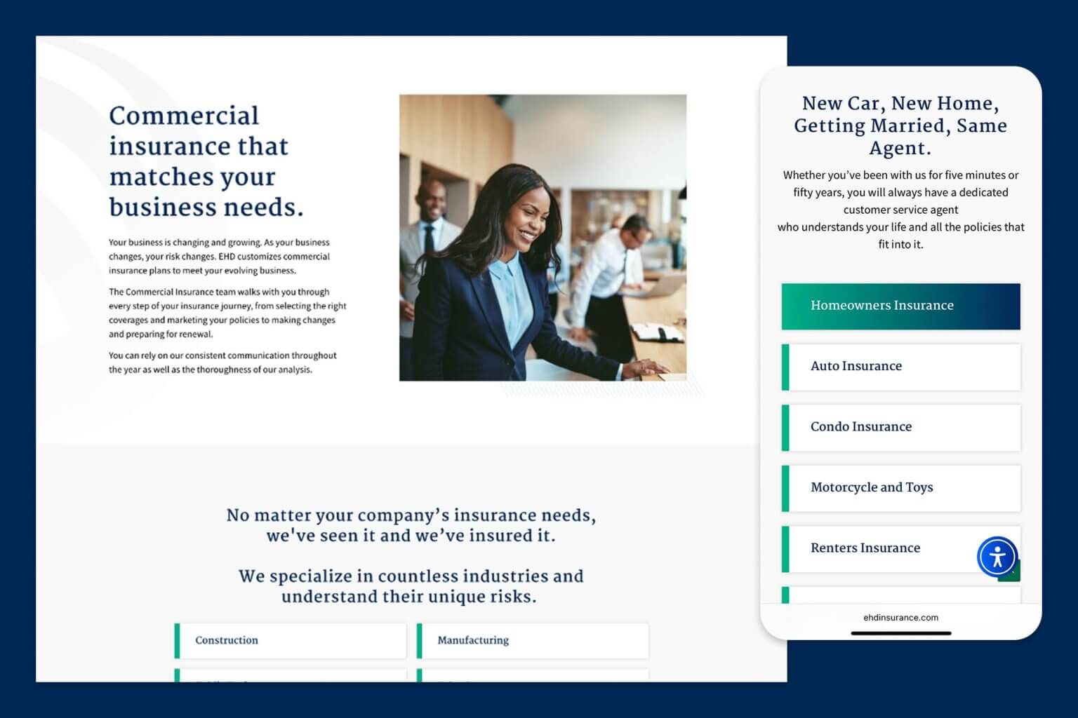
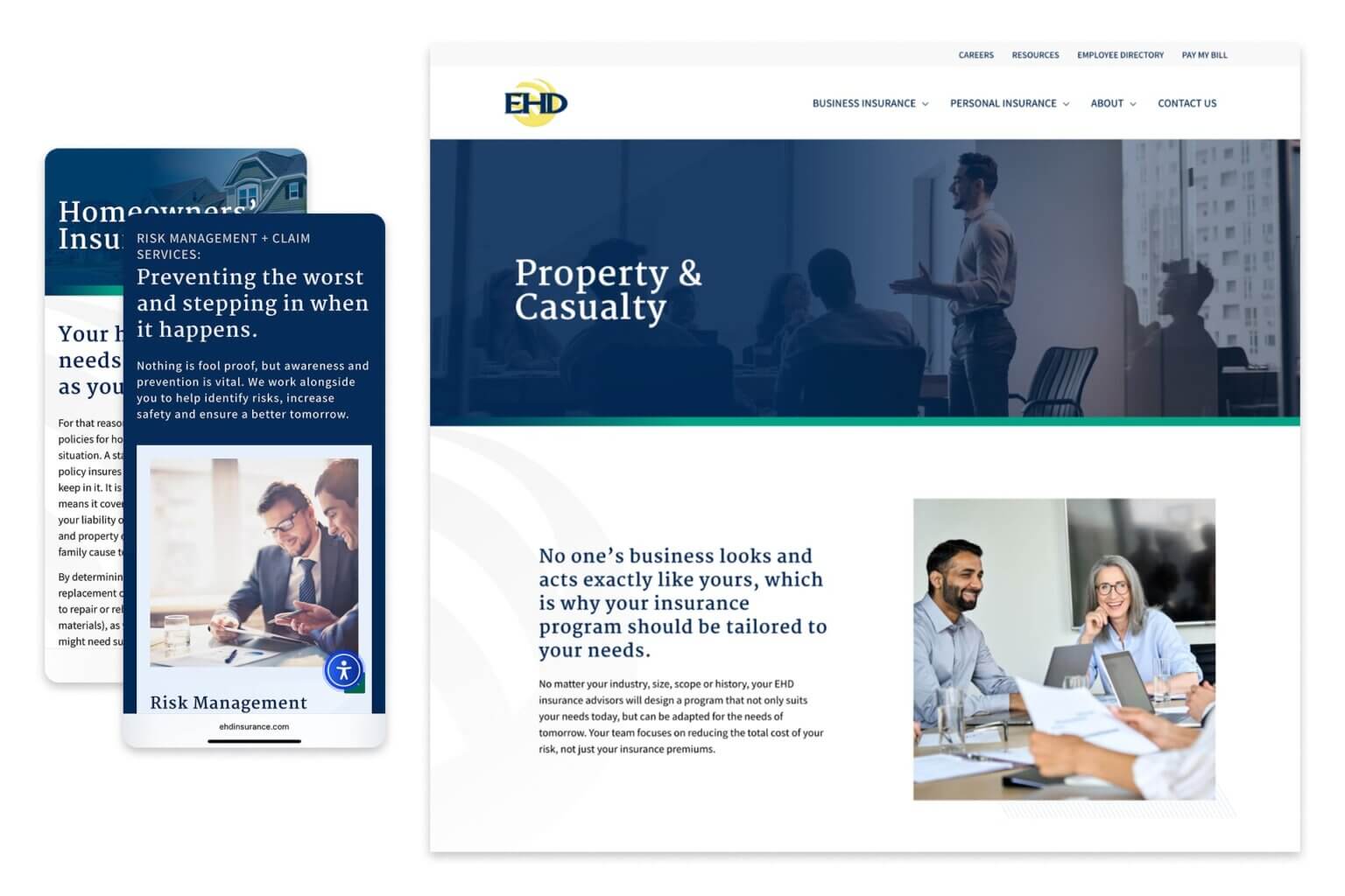
- Visually and structurally defining the three pillars of the business—Personal, Commercial, and Benefits—giving each its own space while preserving a cohesive brand experience.
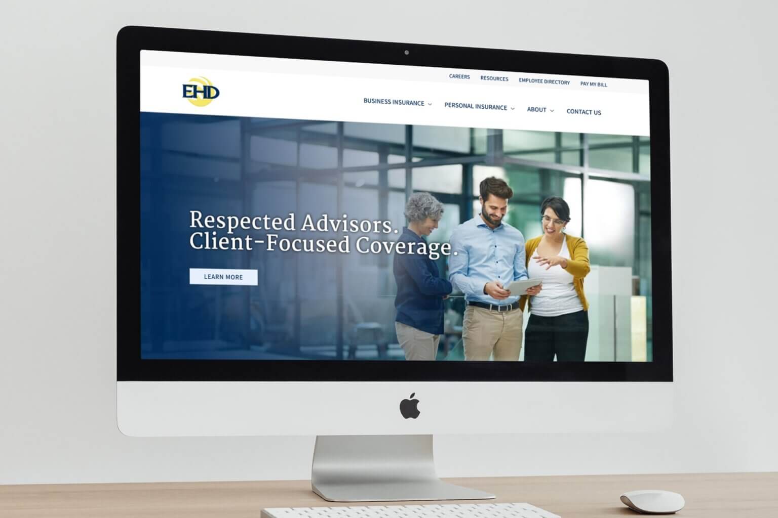
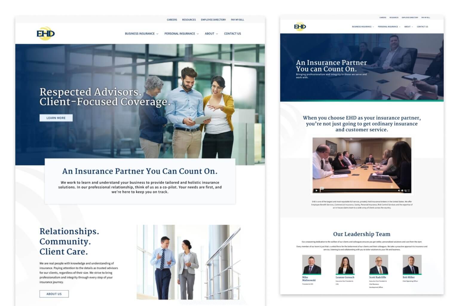
- Slightly modernizing the brand's digital presence with updated typography, refined spacing, and subtle UI accents that elevate the look without straying from EHD's established identity.
- Incorporating new photography and visual assets to bring warmth, professionalism, and human connection to key pages and service areas.
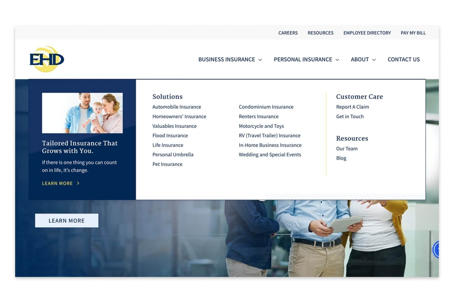
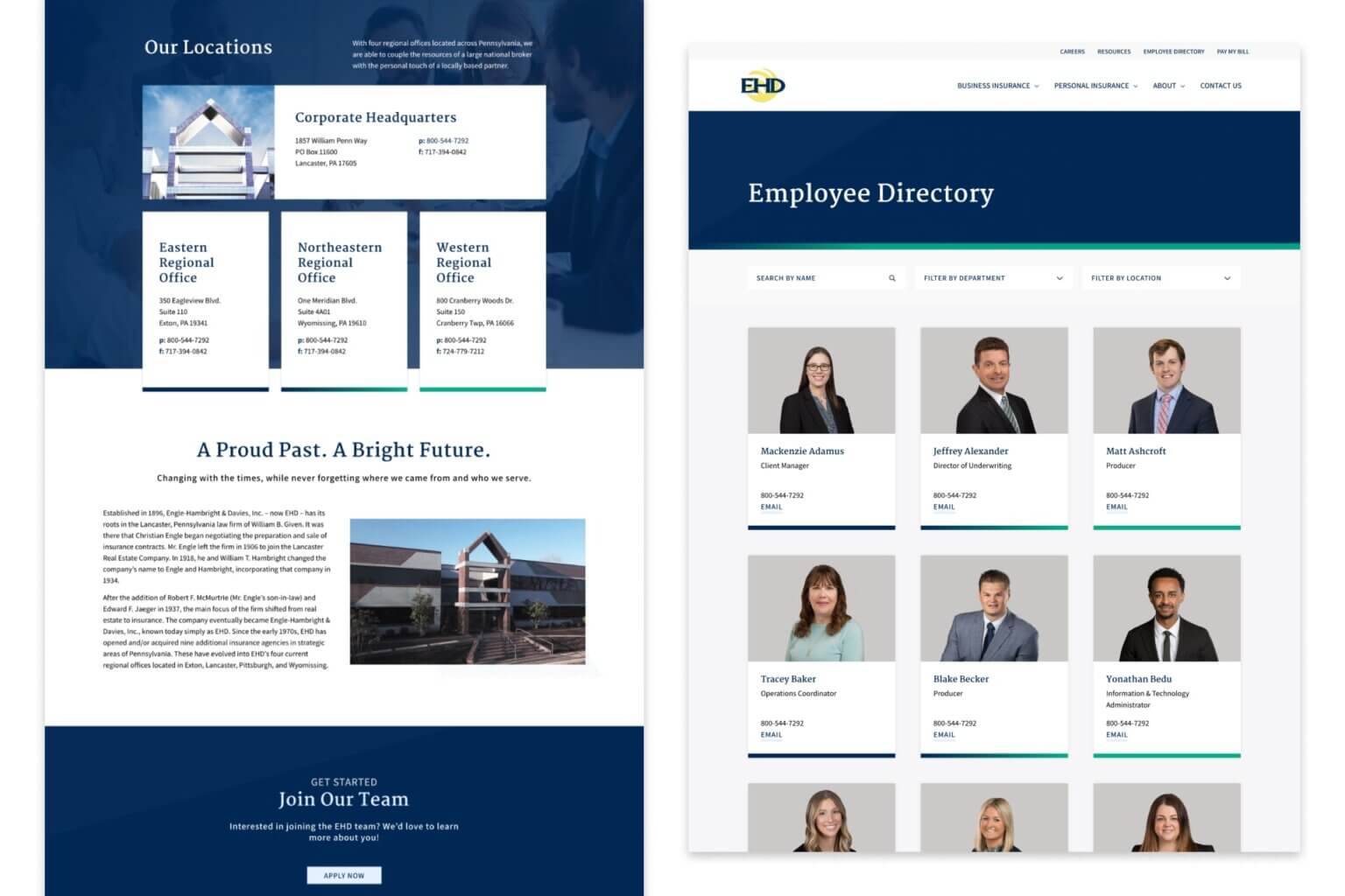
- Developing a streamlined internal contact guide, helping employees and clients quickly locate and connect with the right insurance agent.
- Building modular, flexible content blocks in WordPress, allowing the EHD team to easily manage content while keeping the site visually consistent.
- Crafting a responsive, accessible design that performs well across all devices and user types.
The result is a modernized site that reflects who EHD is today—professional, trusted, and service-focused—without losing the equity of the brand they’ve built over time.
- Website Strategy
- UX/UI Design
- Brand Refinement
- Custom CMS Development
- Internal Tools
- Responsive Design
Ready to start your next project? We’re ready, too!
Key Outcomes
The redesign features three distinct yet unified service pillars where Personal, Commercial, and Benefits offerings are clearly separated both visually and structurally, helping users self-identify and navigate with ease. The modernized brand presence incorporates subtly refined typography, layout, and visual design to bring a fresh, modern feel without altering the core brand identity. Updated photography and visual accents are strategically used alongside subtle design flourishes to enhance the brand's tone and humanize the user experience. A streamlined internal guide and contact directory provides a custom-built tool that improves agent visibility and accessibility, supporting both internal workflows and client communication. The flexible CMS structure utilizes WordPress templates and content modules to enable ongoing updates while maintaining brand consistency. Finally, improved UX and lead pathways feature simplified navigation and thoughtful CTAs that support conversion and retention across the entire site.